Can You Have Too Much Color Contrast?
May 4, 2026
Tech Notes
Yes, you can.
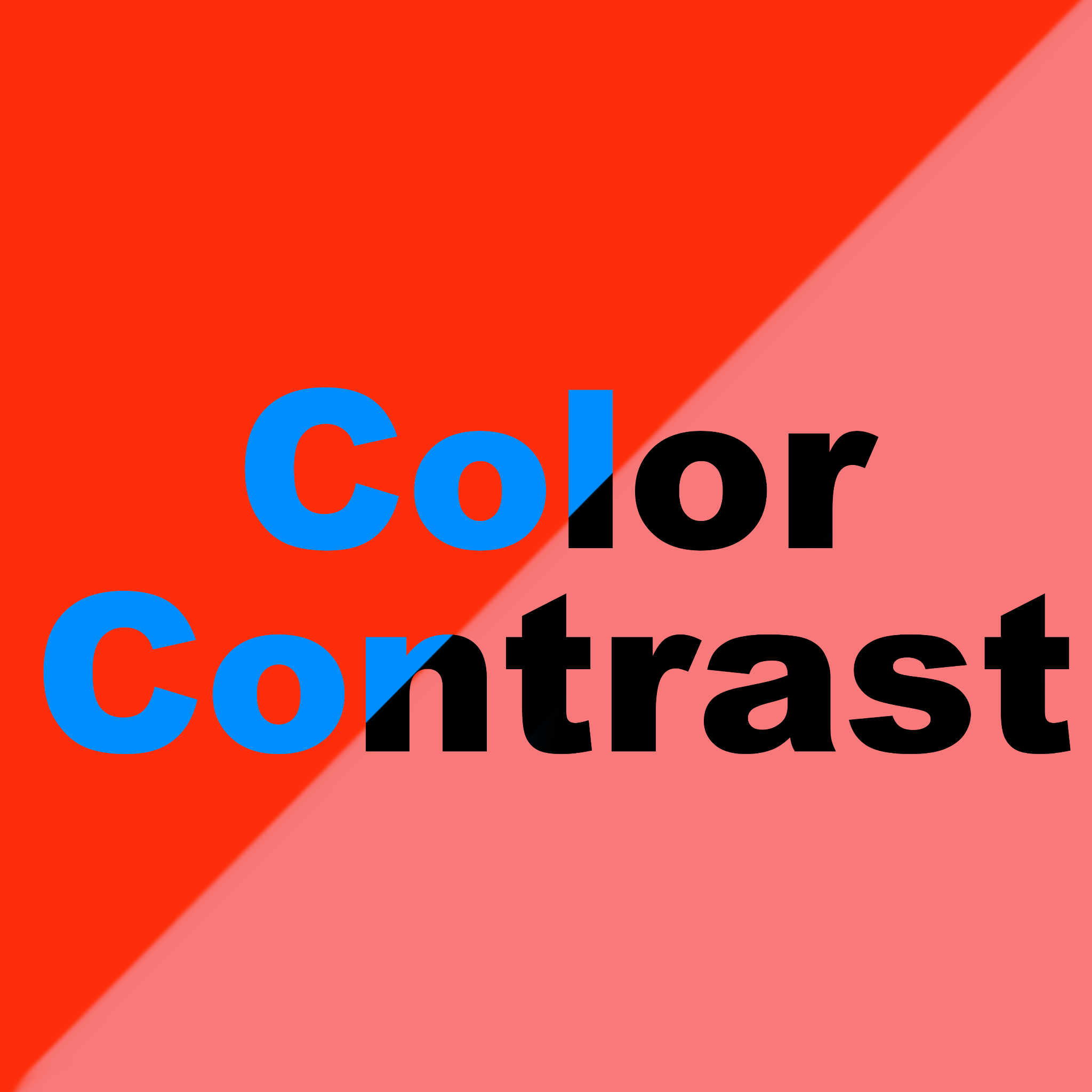
One of the first things discussed in the realm of visual accessibility is color contrast. Particularly, there’s an emphasized minimum color contrast ratio that must be met for your design to be considered accessible. It seems intuitive enough: if your contrast is too low, text will be too faint, and people will have a hard time reading it, or may be downright unable to read it if they have color vision deficiency or low vision. So, shouldn’t the solution be to simply make your contrast as strong as possible?
It’s slightly more nuanced than that.
What is Color Contrast, and How is it Calculated?
In short, color contrast is the difference in brightness between foreground and background colors. In the context of accessibility, the accepted standard target for legal compliance and usability is the WCAG Success Criteria 1.4.3 for level AA, which requires that “the visual presentation of text and images of text has a contrast ratio of at least 4.5:1” while “large-scale text and images of large-scale text have a contrast ratio of at least 3:1.” That should cover your bases well, but WCAG Level AAA (the highest and most stringent level of conformance) actually requires a contrast ratio of at least 7:1 for normal text and 4.5:1 for large text.
But what do those numbers mean? That final ratio is a result of the formula (L1 + 0.05) / (L2 + 0.05), where L1 is the relative luminance (brightness) of the lighter color, and L2 is the relative luminance of the darker color. That is quite technical, and you can dive deeper into that equation if you wish, but luckily, there are many tools available that calculate that for us in seconds, such as WebAim’s contrast checker. That ratio can be anywhere between 1:1 (no contrast at all) and 21:1 (black and white).
It is important to formally check the contrast and not only depend on your own visual judgment. Colors will seem different to folks with different color vision, so it is easy to get a false sense of contrast. For example, with perfect color vision, it may be easy to distinguish bright red or mid-green from a blueish or purpleish background. But that is totally irrelevant to contrast and may fail or pass WCAG requirements at (seemingly) random. That is because in the ratio calculation, only luminosity is considered, meaning tone is irrelevant. So, visually distinctive colors don’t necessarily mean higher contrast, even if it might look that way to some, and thus, you must always double-check your choices.
However, at the risk of sounding contradictory, the final ratio is not the only important thing. Color combinations must be considered alongside contrast– because even if they pass WCAG, the combination might still be bad.
Color Contrast, Color Combos, and How to Not Mess It Up
Our vision works in a spectrum. Without diving too deeply into the can of worms that is color theory, contrast that is too high (about 14:1 and above) can cause eye strain, headaches, overstimulation, and in extreme cases, can even trigger epileptic seizures.
Have you ever looked at a color combo that seemed to “vibrate”? Maybe a poorly designed Christmas card with bright red on bright green? That effect, labeled color vibration, is usually (though not always) due to highly saturated complementary colors being placed next to each other. That causes the eye's lens to struggle to focus on the different wavelengths simultaneously, creating a blurred, glowing, or moving illusion. Some color combinations known to cause this effect include green and magenta, blue and orange, and yellow and cyan.
Some of these color combinations can technically pass WCAG’s success criteria. For example, both neon green on a TV-blue and optic yellow on Barney-purple meet WCAG AA requirements, but would still be considered “uncomfortable” color pairings that can cause some of those previously mentioned effects. Even the classic black-and-white combo, which passes with the maximum contrast score, is known to cause afterimages and eyestrain. Take a long, dense article, for example: people have a much easier time reading light grey text on dark gray backgrounds than white text on black backgrounds, which is why you’ll see many websites opting out of pure black and white. This is not to say that it is a terrible color combination; context also matters. How a user interacts with your page is an important factor when choosing colors. Consider scrolling, for instance. With high contrast colors (say, parallel black and white lines), it probably wouldn’t cause much of an issue in its static view. However, once the user starts scrolling, it may create a strobing effect.
What Does That Mean for My Design Journey?
When thinking accessibly, legal and technical requirements will always matter, but it is also important to consider the holistic user experience. What might look like sufficient color contrast for someone with normal color vision may not meet the minimum threshold for contrast, so it is always important to check mathematically. But that should not be the stopping point. Consider your color combinations: Is my contrast too high in the wrong context? Have I accidentally used some of the known color combinations that “vibrate”?
Most importantly, don’t be afraid to rely on known information and utilize your resources! Here are some to keep in your back pocket during your design and development process:
- WebAim’s Color Contrast Checker
- Color Safe accessible palette generator
- Venngage accessible palette generator
- Vibrating color combos to avoid (Penn State)
- In addition to some good old user testing!
About The Author
Hanna Melo Fugulin is the Internship Ambassador for the American Foundation for the Blind’s Talent Lab program, with a degree in Computing Technology and Software Development as well as Math and Operations Support and Services. Hanna is driven by the idea of an inclusive world that fits and serves people, focusing a lot on advocacy and the intersection of technology and humanities. Outside of their work and miscellaneous studies, you can find them deep diving in the many tangents of the artistic world.
About AFB Talent Lab
The AFB Talent Lab aims to meet the accessibility needs of the tech industry – and millions of people living with disabilities – through a unique combination of hands-on training, mentorship, and consulting services, created and developed by our own digital inclusion experts. To learn more about our internship and apprenticeship programs or our client services, please visit our website at www.afb.org/talentlab.